Rethinking 3C Retail’s online presence
3C Retail stands as one of Denmark’s largest companies. With a diverse portfolio of financial companies under its belt, the company’s reputation precedes it. However, with an ever-evolving digital landscape, 3C Retail recognised the need to revamp its online image. The main objective? To reinforce and demonstrate 3C Retail values, culture, and strong geographical position.
Our challenge
A brand as prominent as 3C Retail demanded a design that was not only functional but also a true representation of its values, culture, and formidable position in Denmark’s geography. The challenge lay in visually communicating these facets while ensuring the design felt fresh, engaging, and aligned with modern design sensibilities.

Our approach
Deep dives and collaboration
We initiated the project by interviewing 3C Retail’s Head of HR. This provided invaluable insights into the company’s ethos and vision for its future. Moreover, our collaboration with their marketing team was instrumental in ensuring that our designs were visually appealing and deeply aligned with 3C Retail's strategic objectives.
Visual strategy
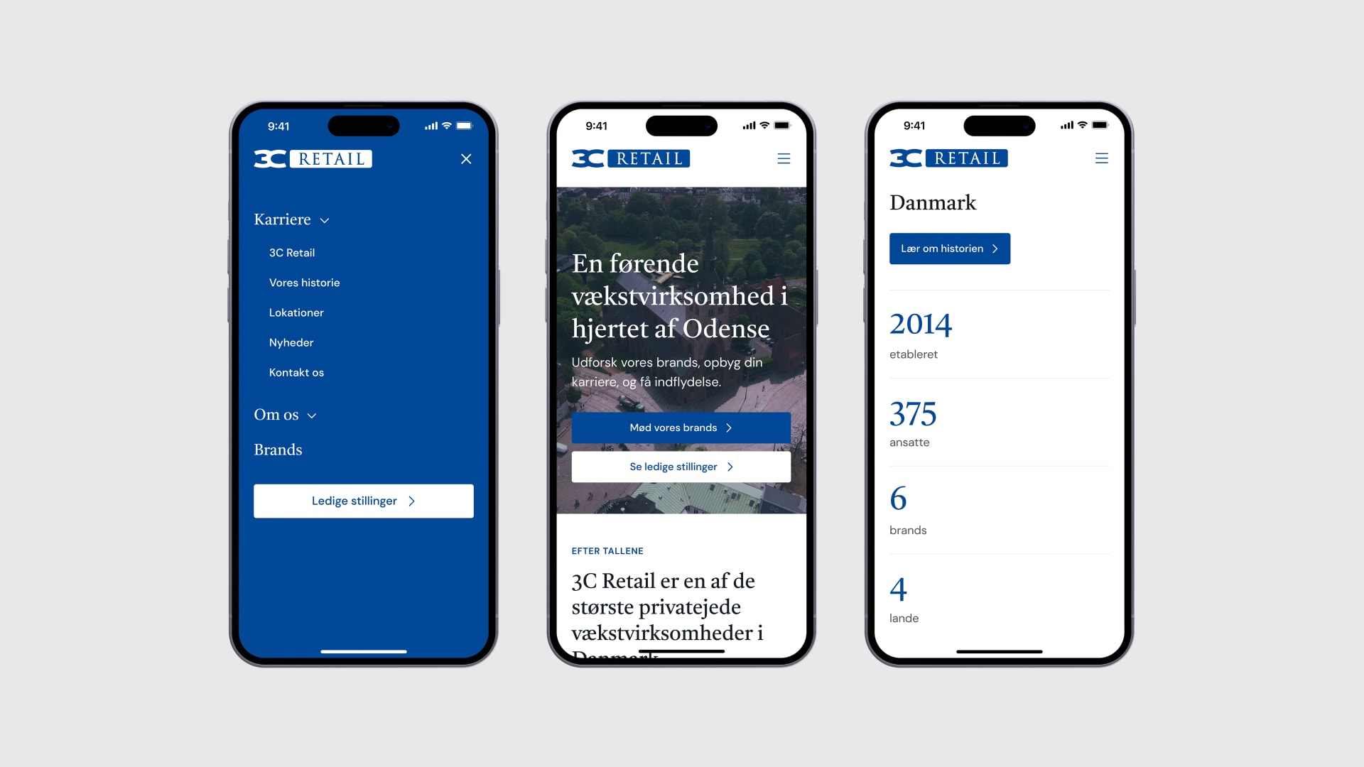
Drawing from the information gathered, our design philosophy was rooted in creating a balance. We integrated playful illustrations and vibrant colours to capture the company’s dynamic spirit. We employed strong typography to complement this, ensuring the brand’s gravitas wasn’t overshadowed.
Mobile-first design
Recognising the increasing shift towards mobile browsing, our design strategy prioritised mobile interfaces. This approach ensured that 3C Retail’s digital presence was optimised for every user, regardless of their chosen device.

Outcome
The culmination of our efforts resulted in a website that was visually stunning and deeply resonant with 3C Retail’s brand identity. The design seamlessly integrated the company’s values and culture, while its mobile-first approach ensured a flawless user experience across devices.
As the final step in our collaboration, we meticulously documented our designs and handed them over to 3C Retail’s development partner, ensuring a smooth transition from design to development.
Keep on reading
We have handpicked a few related news stories and articles for you.


Creating coherent user experiences on different devices
Want to learn more?
Leave your phone number, and Frederick will give you a call. No strings attached.
