Designing a modern insurance experience for loyal customers
Popermo has always aimed to serve its members with clarity, commitment, and convenience, making it a trusted insurance provider for professionals, including police, firefighters, and other select groups of professionals.
The objective
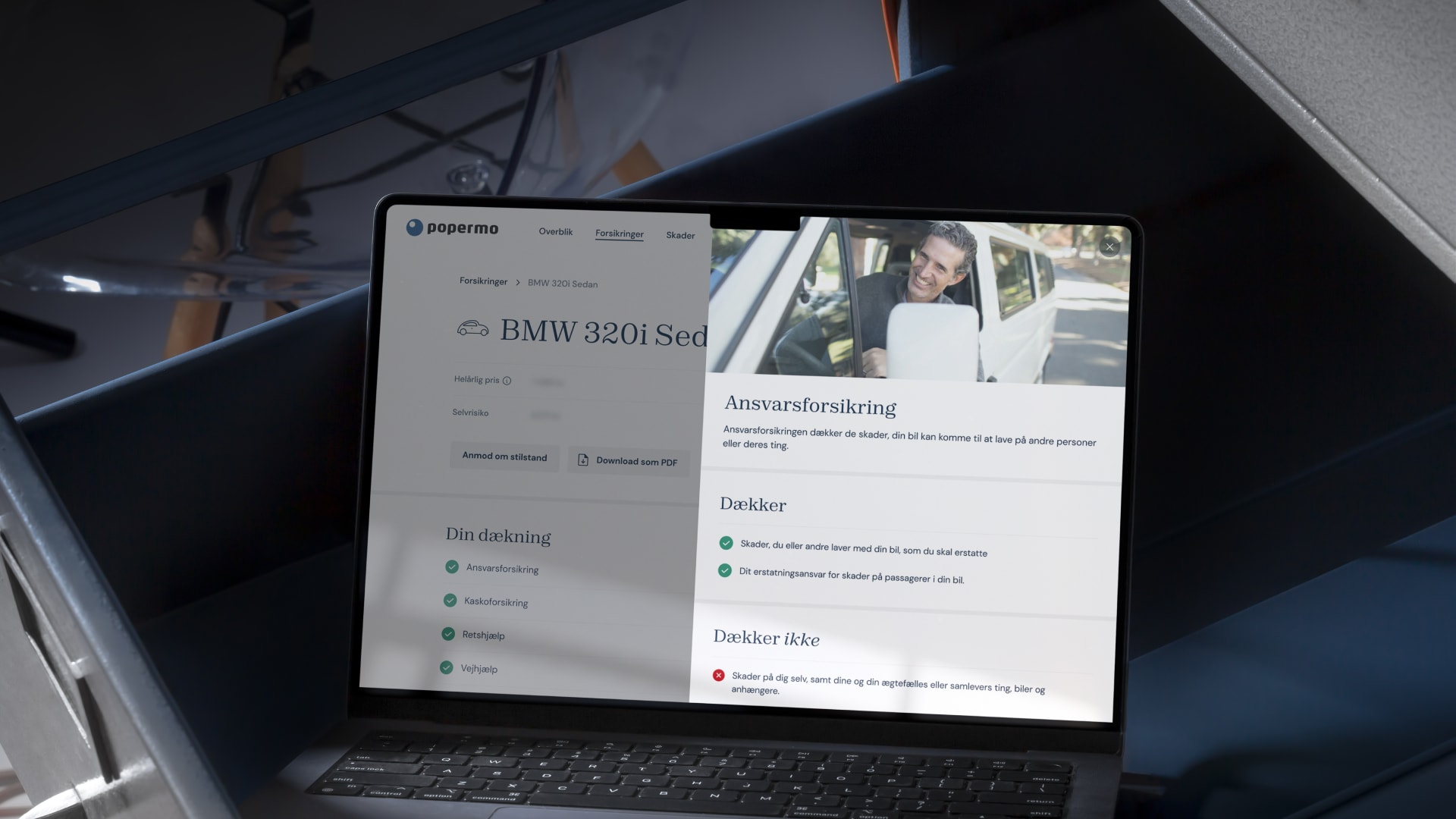
Together with Ecreo, we were asked to redesign and relaunch Popermo’s member insurance universe. While the primary goal was to enhance the mobile app’s user experience, we aimed to improve the entire customer journey.

Our approach
Research and discovery
We laid out a straightforward UX research approach.
- Market research: We delved deep into the insurance market to understand the current trends, competitors’ offerings, and areas of potential innovation.
- Stakeholder interviews: Direct conversations with stakeholders gave us invaluable insights into Popermo’s vision, challenges, and aspirations.
- Workshops: Engaging workshops allowed us to brainstorm and conceptualise innovative solutions tailored for Popermo.
- Desk research: A thorough analysis of App Store reviews added a layer of real-user feedback to our research.
Brand touch-up
While Popermo had a solid brand presence, we believed a slightly modern touch would resonate better with the evolving audience. The branding was subtly refreshed to align with contemporary aesthetics.
Designing for the youth
The insurance domain can often feel overwhelming, especially for adolescents who are new to the concept. We designed an interface that feels current and relatable, simplifying the insurance experience for younger users.
Rethinking legacy features
One major challenge was enhancing the UX design of legacy features without making extensive changes to the backend and data structure. This constraint demanded close collaboration with the development team. Together, we balanced creativity and feasibility, ensuring a seamless experience for users without revising much code.

Outcome
The renewed Popermo member insurance universe is a testament to collaborative effort and a deep understanding of user needs.
We delivered an approachable and updated insurance experience, ensuring that Popermo remains a go-to choice for its dedicated members.
Keep on reading
We have handpicked a few related news stories and articles for you.


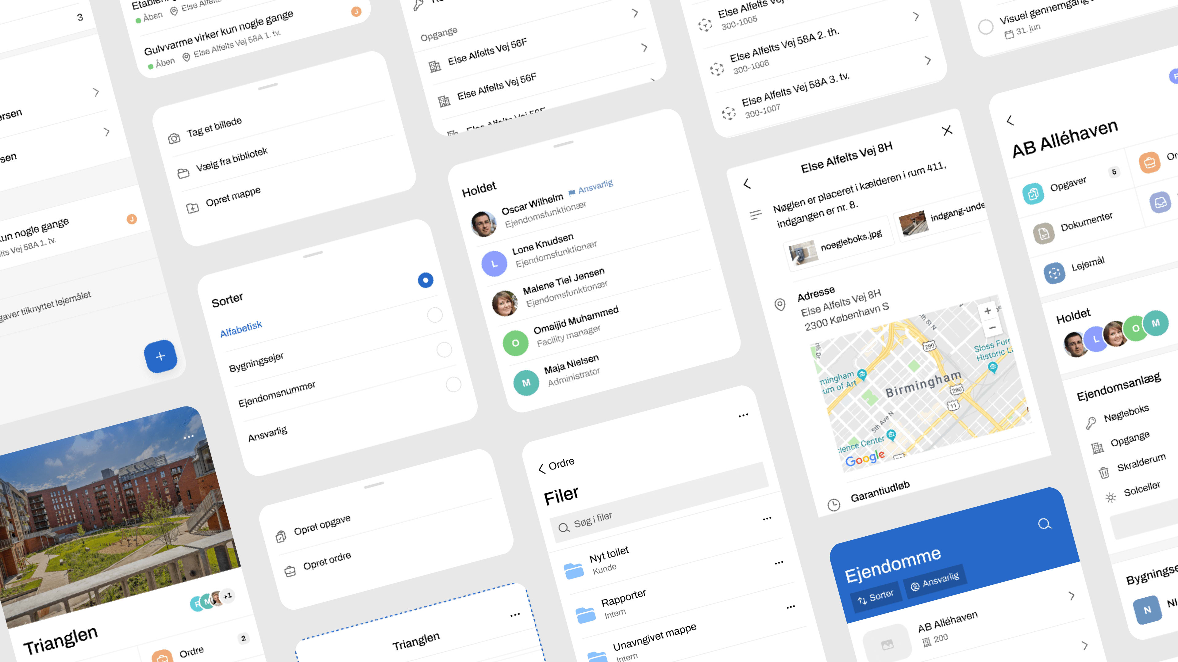
Creating coherent user experiences on different devices
Want to learn more?
Leave your phone number, and Frederick will give you a call. No strings attached.
