Consumer-centric website for L’easy
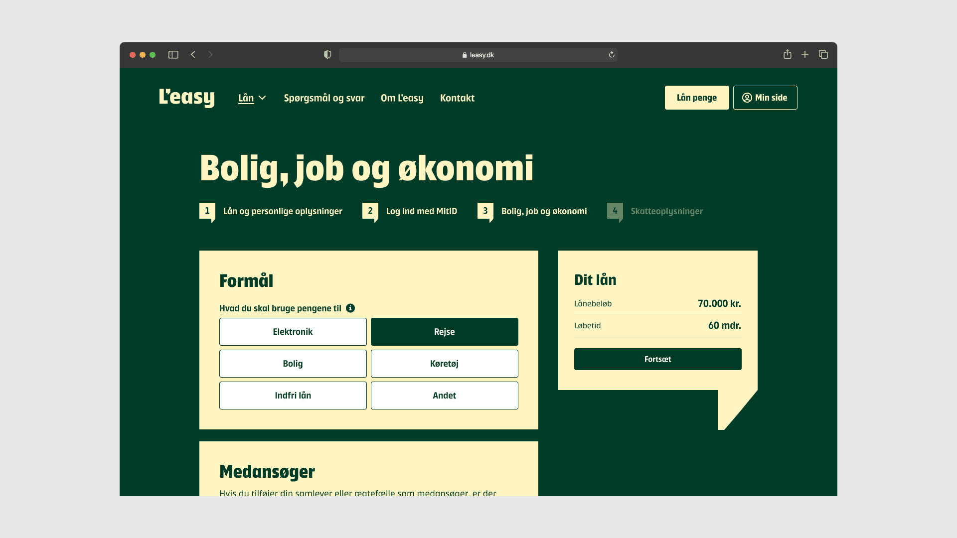
Our collaboration with L’easy resulted in a new website that not only communicates their strategic focus but also successfully integrates their fresh brand overhaul into their online presence, showcasing the effectiveness of our partnership.
Our goal was to craft a high-converting, consumer-centric site. We translated L’easy’s vibrant new identity, designed by Kontrapunkt, into a digital, scalable experience.
Starting with competitor research and customer interviews, we built wireframes to ensure a seamless UX and clear IA. Our mobile-first design emphasized accessibility, scalability, and trustworthiness, creating unique components that set L’easy apart.
The result? A solid foundation for L’easy to grow their brand and product offerings effectively.
- Year 2024
- Partner L’easy
- Service Digital presence, UX research


Want to learn more?
Leave your phone number, and Frederick will give you a call. No strings attached.

Get in touch
Keep on reading
We have handpicked a few related news stories and articles for you.

