Designing clarity into personal finance
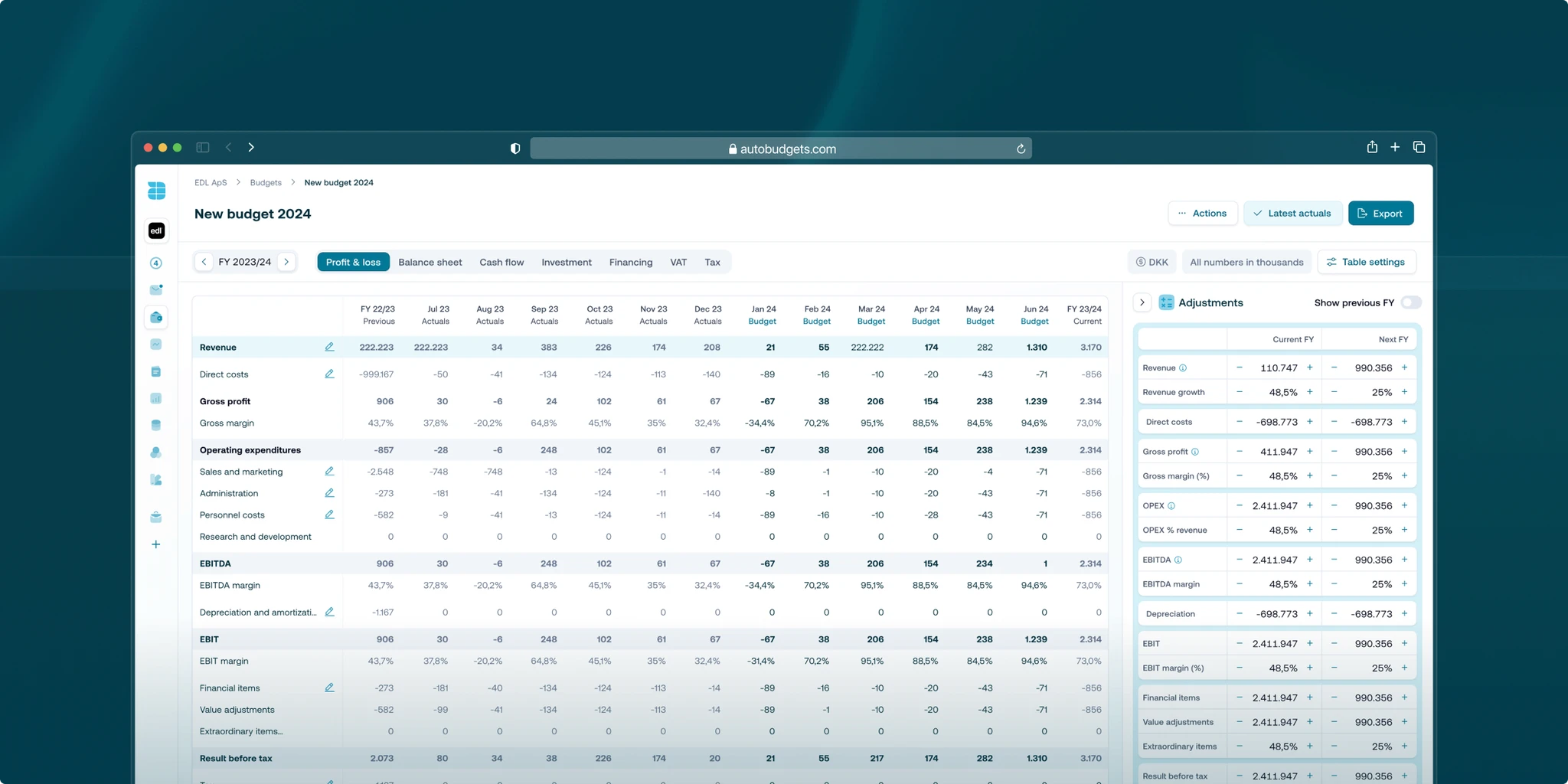
We teamed up with Autobudgets, a fintech startup with a clear mission: make budgeting simple and accessible for everyone. Their product offered smart automation and forecasting tools, but the experience needed refining.
The interface was too dense, and onboarding was causing friction. We came in to rework the product experience from the ground up—starting with a detailed look at their UX, onboarding, and visual design.
Our aim wasn’t just to polish what was already there. It was to create a more intuitive flow, reduce cognitive load, and bring clarity to a product that manages something inherently complex: personal finances.
Building trust fast in a compressed timeline
Autobudgets had a three-month runway to prepare for their next funding milestone. That meant we had to move quickly, without cutting corners. Every decision had to contribute directly to usability, scalability, or visual clarity.
There was also the challenge of building trust. Budgeting tools live or die by how confident users feel while using them. We needed to strike the right balance between automation and control—giving users visibility over their finances without overwhelming them.
We also had to align closely with a small but fast-moving internal team. With the CTO and front-end developer leading the build, design couldn’t exist in a silo. Tight coordination was non-negotiable.
Embedded, aligned, and shipping early
We kicked things off with a full product audit. That helped us uncover pain points in the existing journey—unclear onboarding flows, cluttered dashboards, and inconsistent UI patterns. We mapped out user paths, defined key actions, and prioritised what needed fixing versus what needed rethinking entirely.
From there, we moved fast into prototyping. We worked in short, focused design sprints, testing early and often with the Autobudgets team. This collaborative approach let us validate assumptions quickly, ship usable flows early, and gather continuous feedback.
At the same time, we built a scalable design system from scratch. This wasn’t just about consistency—it was about efficiency. By creating a shared component library, we gave their developers the tools to move faster and keep the product cohesive as it evolved.
We weren’t just delivering screens. We were building a framework they could grow with. Every element was designed to be reused, expanded, and adapted.
A better product, built to grow
The redesigned product delivered immediate wins. Users now have a clearer path through onboarding, better visibility into their spending, and a more guided experience throughout. Key interactions feel lighter and more responsive, reducing friction and boosting engagement.
Beyond the improved UX, Autobudgets now has a design foundation that supports scale. Their team can move quickly with confidence, using the component library and systemised styles to build new features without starting from scratch.
Most importantly, the product now tells a clearer story. It feels trustworthy, intuitive, and focused. That matters in fintech, where user trust is everything.
Autobudgets is now better positioned to attract users, impress investors, and expand their offering without losing coherence. The work we did together wasn’t just a visual update—it was a strategic redesign with long-term impact.


